
フォトショップでデザインしたデザインカンプからコーディングしていきます。
自分でデザインして自分でコーディングする場合は、コーディングの変更もあり!と思ってしまいますが、デザイナーさんから送られてきたデザインカンプは、「1pxの想い」で作成されてますので、コーディングでデザインが変わってしまった。。。。
は、自分の評価もだだ下がりですし、次のお仕事に繋がりません。
デザインされたものをなるだけ正しくコーディングするよう心がけましょう。
今回のコーディングの最終目標
今回のページは、
- フォトショップで(レイアウトはトレースだが)画像を差し替えて、テキストもそれなりに打ち替えているので、オリジナルデザイン
- HTML CSSでコーディング
- スライダーを設置
- ニュースのシングルページデザイン
- WordPress化
- プラグイン設置
- カスタム投稿「News」の設定
- シングルページ設定
- お問い合わせページ コンタクトフォーム7設置
- コンタクトフォーム7コーディング
- AIOSEO設定
- その他、余力があれば、いろいろ。。。
この一連の作業を、wordpressの授業や、jQury 諸々、、、と他の制作物と並行してわせて行っていきます。
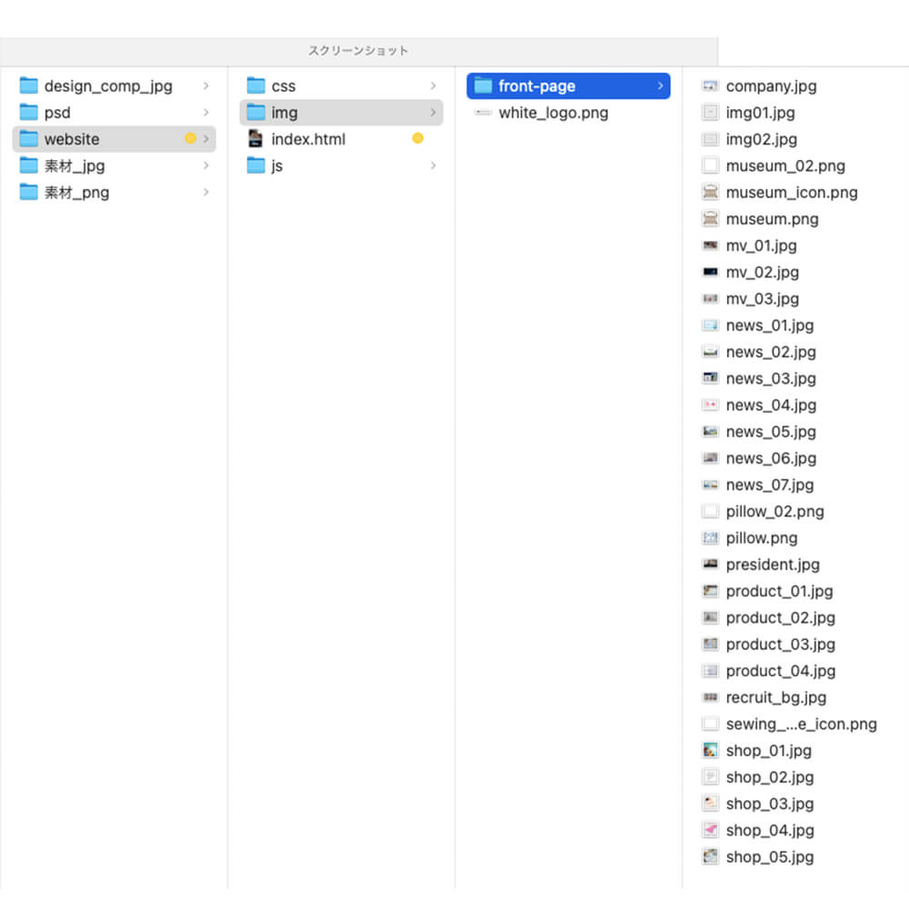
フォルダー階層の確認
今回は、最終的にWordoress化するのでトップページの「img」のフォルダーに「front-page」という名前のフォルダーを作成してその場所にトップページの画像を入れます。
css配布
今回は、ホバーアクションなど少し複雑なところもありますので、プロダクト部分のset1.cssと、他のページで使用するかもしれないので、リセット扱いとして考えてもらえればOK!なhover.cssを配布します。
サイト制作を進めていく上で、後日必要なCSSもあると思いますので、気にかけてもらうだけで良いです。
全体を確認
HTMLの中に、大きく分けて
「head」「body」があります。

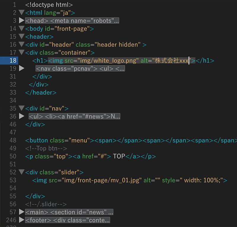
HEADER部分を作成
設定のポイント
- 4行目:テストサイトなので、クロールさせない
- 7行目:Vieport設置
- 8行目:フォントオーサム
- 12行目:style.cssは最後

HEADERとNAVの設定
- headerとnavは→display: flex;
- navはPCとSPで2種類作成
クラス名:pcnav →PC表示のみ
クラス名:nav →SP表示のみ
MAIN部分の中にSECTION分けされた項目を作成
今回は今回は、トップページのみの作成なので、ページ内リンクを施したいので、
<section id="">ここにコンテンツ</section>
にします。
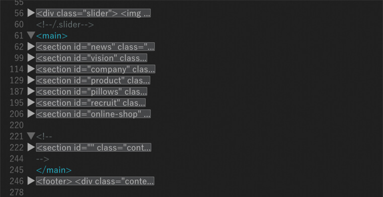
上記をふまえて、セクションまでのマークアップをしてみましょう!
デモサイト
HTML PC表示までのマークアップ
<!doctype html>
<html lang="ja">
<head>
<meta name="robots" content="noindex">
<meta charset="utf-8">
<title>STEP01 | DEMOサンプルサイト DEEPSLEEP</title>
<meta name="viewport" content="width=device-width">
<link rel="stylesheet" href="https://use.fontawesome.com/releases/v5.6.3/css/all.css">
<!--CSS HOVER -->
<link rel="stylesheet" type="text/css" href="css/hover.css" />
<link rel="stylesheet" type="text/css" href="css/set1.css" />
<link href="css/style.css" rel="stylesheet">
</head>
<body id="front-page">
<header>
<div id="header" class="header hidden" >
<div class="container">
<h1><img src="img/white_logo.png" alt="株式会社xxx"></h1>
<nav class="pcnav">
<ul>
<li><a href="#news">NEWS</a></li>
<li><a href="#vision">VISION</a></li>
<li><a href="#company">COMPANY</a></li>
<li><a href="#product">PRODUCT</a></li>
<li><a href="#recruit">RECRUIT</a></li>
<li class="nav_contact hidden"><a href="index.html#contact" target="_blank">CONTACT</a></li>
<li class="nav_cart hidden"><a href="#online-shop"><i class="fas fa-shopping-cart"></i>ONLINE SHOP</a></li>
</ul>
</nav>
</div>
</div>
</header>
<div id="nav">
<ul>
<li><a href="#news">NEWS</a></li>
<li><a href="#vision">VISION</a></li>
<li><a href="#company">COMPANY</a></li>
<li><a href="#product">PRODUCT</a></li>
<li><a href="#recruit">RECRUIT</a></li>
<li><a href="#pillows">PILLOW MUSEUM</a></li>
<li><a href="#contact" target="_blank" >CONTACT</a></li>
<li><a href="#online-shop"><i class="fas fa-shopping-cart"></i>ONLINE SHOP</a></li>
</ul>
</div>
<div class="slider">
<!--仮イメージを貼り付けてます!スライダー設定予定-->
<img src="img/front-page/mv_01.jpg" alt="" style=" width: 100%;">
</div>
<main>
<section id="news" class="content-box-01 news container">
<h2 class="ttl">NEWS</h2>
<p class="sub-txt">お知らせ</p>
<div class="box">
<div class="news_01"><a href="#">
<p class="img_wrap"><img src="img/front-page/news_01.jpg" alt=""></p>
<p class="time">
<time>2020-01-01</time>
</p>
<p>新型コロナウイルス感染症(COVID-19)に関する取りくみについて </p></a>
</div>
<div class="news_01"><a href="#">
<p class="img_wrap"><img src="img/front-page/news_02.jpg" alt=""></p>
<p class="time">
<time>2020-01-01</time>
</p>
<p>ここにテキスト が入ります。ここにテキスト が入ります。 </p></a>
</div>
<div class="news_01"><a href="#">
<p class="img_wrap"><img src="img/front-page/news_03.jpg" alt=""></p>
<p class="time">
<time>2020-01-01</time>
</p>
<p>ここにテキスト が入ります。ここにテキスト が入ります。 </p></a>
</div>
<div class="news_01"><a href="#">
<p class="img_wrap"><img src="img/front-page/news_04.jpg" alt=""></p>
<p class="time">
<time>2020-01-01</time>
</p>
<p>ここにテキスト が入ります。ここにテキスト が入ります。 </p></a>
</div>
</div>
<div class="more view-more">
<div class="effect"></div>
<a href="#" target="_blank">VIEW MORE<i class="fas fa-caret-right"></i> </a></div>
</section>
<section id="vision" class="content-box vision">
<h2 class="ttl">VISION</h2>
<p class="sub-txt">私たちのビジョン</p>
<div class="box flex-start">
<div class="left"> <img src="img/front-page/president.jpg" alt=""></div>
<div class="right box-inner">
<h3 class="ttl">「ここにテキストが入ります。」</h3>
<p>ここにテキストが入ります。ここにテキストが入ります。ここにテキストが入ります。ここにテキストが入ります。ここにテキストが入ります。ここにテキストが入ります。ここにテキストが入ります。ここにテキストが入ります。ここにテキストが入ります。ここにテキストが入ります。</p>
<div class="more view-more_02">
<div class="effect"></div>
<a href="vison.html" target="_blank">VIEW MORE<i class="fas fa-caret-right"></i> </a></div>
</div>
</div>
</section>
<section id="company" class="content-box company">
<h2 class="ttl">COMPANY</h2>
<p class="sub-txt">会社概要</p>
<div class="box flex-end">
<div class="right"> <img src="img/front-page/company.jpg" alt=""></div>
<div class="left box-inner">
<h3 class="ttl">「ここにテキストが入ります。」</h3>
<p>ここにテキストが入ります。ここにテキストが入ります。ここにテキストが入ります。ここにテキストが入ります。ここにテキストが入ります。ここにテキストが入ります。ここにテキストが入ります。ここにテキストが入ります。ここにテキストが入ります。ここにテキストが入ります。</p>
<div class="more view-more_02">
<div class="effect"></div>
<a href="company.html" target="_blank">VIEW MORE<i class="fas fa-caret-right"></i> </a></div>
</div>
</div>
</section>
<section id="product" class="content-box product">
<div class="left_01">
<div class="box-inner_01">
<div class="logo_01"><img src="img/white_logo.png" alt="株式会社DEEPSLEEP"></div>
<h2 class="ttl_01">PRODUCT</h2>
<p class="sub-txt_01">商品紹介</p>
<p>ここにテキストが入ります。ここにテキストが入ります。ここにテキストが入ります。ここにテキストが入ります。</p>
</div>
</div>
<div class="more view-more_03">
<div class="effect "></div>
<a href="products.html" target="_blank">VIEW MORE<i class="fas fa-caret-right"></i> </a> </div>
<div class="product_box">
<div class="grid">
<figure class="effect-bubba"><a href="#">
<img src="img/front-page/product_01.jpg" alt=""/>
<figcaption>
<h2>BED
<span> ベッドグッズ</span></h2>
<p>ここに簡単な商品説明のテキストが入ります。1行19文字MAX36文字位</p>
</figcaption></a>
</figure>
<figure class="effect-bubba"><a href="pillow.html" target="_blank">
<img src="img/front-page/product_02.jpg" alt=""/>
<figcaption>
<h2>PILLOW <span> 枕</span></h2>
<p>ここに簡単な商品説明のテキストが入ります。1行19文字MAX36文字位</p>
</figcaption></a>
</figure>
</div>
<div class="grid">
<figure class="effect-bubba"><a href="#">
<img src="img/front-page/product_03.jpg" alt=""/>
<figcaption>
<h2>BABY's <span> ベビー寝具</span></h2>
<p>ここに簡単な商品説明のテキストが入ります。1行19文字MAX36文字位.</p>
</figcaption></a>
</figure>
<figure class="effect-bubba"><a href="#">
<img src="img/front-page/product_04.jpg" alt=""/>
<figcaption>
<h2>COMFORTER <span> 布団</span></h2>
<p>ここに簡単な商品説明のテキストが入ります。1行19文字MAX36文字位</p>
</figcaption></a>
</figure>
</div>
</div>
<div class="more view-more_04 ">
<div class="effect"></div>
<a href="products.html" target="_blank">VIEW MORE<i class="fas fa-caret-right"></i> </a> </div>
</section>
<section id="recruit" class="content-box recruit">
<div class="content-inner">
<h2 class="ttl">RECRUIT</h2>
<p class="sub-txt">採用情報</p>
<p>ここにテキストが入ります。ここにテキストが入ります。ここにテキストが入ります。ここにテキストが入ります。ここにテキストが入ります。ここにテキストが入ります。ここにテキストが入ります。ここにテキストが入ります。</p>
<div class="box">
<div class="recruite_btn_01"><a href="#">募集要項</a></div>
<div class="recruite_btn_02"><a href="#"> 応募 </a></div>
</div>
</div>
</section>
<section id="online-shop" class="content-box online-shop container">
<!--仮設定:この後スライダーにします。-->
<h2 class="ttl">ONLINE SHOP</h2>
<p class="sub-txt">オンラインショップ</p>
<ul class="box">
<li><a href="#" target="_blank"><img src="img/front-page/shop_01.jpg" alt=""></a></li>
<li><a href="#" target="_blank"><img src="img/front-page/shop_02.jpg" alt=""></a></li>
<li><a href="#" target="_blank"><img src="img/front-page/shop_03.jpg" alt=""></a></li>
<li><a href="#" target="_blank"><img src="img/front-page/shop_04.jpg" alt=""></a></li>
<li><a href="#" target="_blank"><img src="img/front-page/shop_05.jpg" alt=""></a></li>
</ul>
<div class="more view-more">
<div class="effect"></div>
<a href="#" target="_blank">VIEW MORE<i class="fas fa-caret-right"></i> </a></div>
</section>
</main>
<footer>
<div class="content_inner">
<div class="footer_box">
<div class="footer_logo"><img src="img/white_logo.png" alt="株式会社DEEPSLEEP"></div>
<p>ここにテキストが入りますここにテキストが入ります<br>
株式会社xxxxxx</p>
</div>
<div class="footer_box">
<nav class="footer_nav">
<ul class="footer_nav01">
<li><a href="#news">NEWS</a></li>
<li><a href="#vision">VISION</a></li>
<li><a href="#company">COMPANY</a></li>
<li><a href="#product">PRODUCT</a></li>
<li><a href="#recruit">RECRUIT</a></li>
<li><a href="index.html#contact" target="_blank">CONTACT</a></li>
<li><a href="#online-shop">ONLINE SHOP</a></li>
</ul>
</nav>
<nav class="footer_nav">
<ul class="footer_nav02">
<li><a href="#">サイトマップ</a></li>
<li><a href="#">プライバシーポリシー</a></li>
</ul>
</nav>
<p class="copy"><small>Copyright© All rights reserved.</small></p>
</div>
</div>
</footer>
<script src="https://ajax.googleapis.com/ajax/libs/jquery/2.2.4/jquery.min.js"></script>
<!--header fixd 固定-->
<script id="rendered-js" >
// スクロールイベント
window.addEventListener("scroll", function () {
var headerElement = document.getElementById("header"); // `#header`セレクタを取得
var rect = headerElement.getBoundingClientRect(); //
var y = rect.top + window.pageYOffset; // Y方向 (縦)にスクロール量を取得(pageYOffset:windowオブジェクト。現在表示位置のY座標を取得)
if (y > 0) {// 変数yの値が0よりも
headerElement.classList.remove('hidden'); // 大きければhiddensセレクタを削除する
} else {
headerElement.classList.add('hidden'); // そうでなければhiddensセレクタを追加する
}
});
//# sourceURL=pen.js
</script>
</body>
</html>
CSSコーディング PC表示まで
@charset "utf-8";
/* Reset */
html, body, h1, h2, p, ul, li, dl, dt, dd {
margin: 0;
padding: 0;
line-height: 1.5;
/* font-family: "游ゴシック",YuGothic, "Hiragino Kaku Gothic ProN", Meiryo, sans-serif;*/
font-family:'Poppins', "游ゴシック体", "Yu Gothic", YuGothic, "ヒラギノ角ゴシック Pro", "Hiragino Kaku Gothic Pro", 'メイリオ', Meiryo, sans-serif;
font-weight: 500;
}
/*
html{
scroll-behavior: smooth;
}
*/

ul {
list-style: none;
}
img {
border: none;
vertical-align: bottom;
max-width: 100%;
height: auto;
}
a {
text-decoration: none;
color: inherit;
}
a:hover {
color:#c1c1c1;
}
main {
padding: 2%;
}
/*-------------
共通
-------------*/
section {
max-width: 1440px;
margin: 0 auto;
}
.container {
max-width: 1024px;
margin: 0 auto;
padding: 0 10px;
}
.content-box {
padding: 60px 0;
}
.content-box-01 {
padding: 100px 0 50px;
}
.box {
display: flex;
justify-content: space-between;
margin-bottom: 60px;
flex-wrap: wrap;
}
.box.flex-start {
justify-content: flex-start;
}
.box.flex-end {
flex-direction: row-reverse;
justify-content: flex-end;
}
.left, .right {
width: calc(100%/2);
}


/*-------------
page-header 共通
-------------*/

.page-header {
/* height: 500px;*/
background: #f9f9f9;
padding: 0;
margin: 0 auto;
border: none;
position: relative;
overflow: hidden;
}
.page-header_inner {
width: 1200px;
margin: 0 auto;
padding: 200px 0 100px 0;
position: relative;
z-index: 1;
}

.h1_en {
color: #2b2322;
/* color: #BED1D9;*/

font-size: 80px;
letter-spacing: 5px;
line-height: 1.1;
font-weight: bold;
text-transform: uppercase;
}
.h1ttl{
display: block;
padding: 0 0 0 12px;
margin: 0;
border: none;
color: #2b2322;
/* color: #BED1D9;*/
font-weight: bold;
font-size: 15px;
letter-spacing: 3px;
}
.h1ttl_02 {
font-weight:300;

}


@media screen and (max-width:1024px) {
.box {
padding:1%;
}
.content-box-01 {
padding: 60px 0 50px;
}
.content-box {
padding: 0 ;
}
}
@media screen and (min-width:769px){
.pc768 {
display: none;
}
}
@media screen and (max-width:768px){
.sp768 {
display: none;
}

}
@media screen and (min-width:768px){
.pc {
display: none;
}


}
@media screen and (max-width:767px){
.sp {
display: none;
}

.box.flex-start {
display: block;
}
.left, .right {
width: 100%;
}


}


/*--Header--*/
header {
color: #fff;
background: #BED1D900;

}
header .container {
max-width: 1500px;
display: flex;
justify-content: space-between;
align-items: flex-end;
}
header h1 {
font-size: 13px;
}
#header h1 img {
margin: 0 0 7px 0;
max-width: 120px;
}
header p {
font-size: 14px;
}
.header {
position: fixed;
top: 0;
width: 100%;
padding: 1% 0;
background: #BED1D9;
transition: all 0.5s ease;
color: #fff;
z-index: 100;
}
.hidden {
background: none;
transition: all 0.5s ease;
}
.header.hidden a {
color: #fff;
}
i.fas.fa-shopping-cart {
padding: 0 5px 0 0;
}


/*----------------
navigation
----------------*/
.pcnav ul {
display: flex;
text-align: center;
font-size: 13px;
}
.pcnav ul a {
display: block;
padding: 9px 10px;
color: #fff;
}
.pcnav li {
/*
padding: 14px 0;

*/
}
.pcnav li:first-child a {
border: none;
}
.pcnav a:hover {
color: #c1c1c1;
transition: all 0.5s ease;
}

li.nav_contact {
width: 190px;
margin: 0 20px;
}
.header.hidden .nav_contact a {
background: #BED1D9;
color: #fff;
}
.header.hidden .nav_contact a:hover {
background: #fff;
color: #1F1E1E;
}
.header .nav_contact a {
background: #fff;
color: #1F1E1E;
}
.header .nav_contact a:hover {
background: #78a7fc;
color: #fff;
}
li.nav_contact a:hover {
background: #fff;
color: #BED1D9;
}

li.nav_cart {
width: 190px;
}
li.nav_cart a {
background: #78a7fc;
box-sizing: border-box;
}
li.nav_cart a:hover {
background: #fff;
color: #1F1E1E;
}
li.nav_cart > a > i {
margin: 0 5px 0 0;
}
/*Sp Nav*/

.slide {
left: 0;
margin-left: 0;
}

/*Sp Btn*/
.btn {
width: 50px;
height: 50px;
background: none;
text-align: center;
color: #fff;
font-size: 10px;
border-radius: 5px;
position: fixed;
top: 5px;
right: 5px;
z-index: 99999;
display: none;
}

.top {
position: fixed;
z-index: 99999;
bottom: 20px;
right: 20px;
background: #00335573;
color: #fff;
width: 70px;
line-height: 70px;
text-align: center;
border-radius: 50%;
cursor: pointer;
/*display: none;*/
}

@media screen and (max-width:1024px){
li.nav_contact {
width: 100px;
margin: 0 5px;
}
li.nav_cart {
width: 130px;
}
.pcnav ul {
display: flex;
text-align: center;
font-size: 10px;
}
.pcnav ul a {
display: block;
padding: 9px 6px;
color: #fff;
}
}

/*--------------
front-page
--------------*/
h2.ttl {
margin: 0 auto;
text-align: center;
line-height: 1.4;
letter-spacing: 2px;
font-size: 50px;
font-weight: bold;
color: #000;
padding: 10px 0;
}
h3.ttl {
margin: 9% auto;
text-align: center;
}
p.sub-txt {
margin-bottom: 60px;
text-align: center;
}
p.sub-txt_01 {
margin-bottom: 10px;
text-align: left;
}
.box-inner p {
max-width: 600px;
margin: 0 auto;
padding: 2%;
line-height: 2.2;
font-size: 15px;
text-align: left;
}

@media screen and (max-width:1024px){
p.sub-txt {
margin-bottom: 40px;
}

}

@media screen and (max-width:767px){
h2.ttl {
font-size :40px;

}
p.sub-txt {
margin-bottom: 0;
}
}

/*--------------
news
--------------*/
.news_01 {
width: calc(100%/4);
padding: 10px 20px 10px 0;
}
.news_01:last-child {
padding: 10px 0px;
}
.news_01 img {
margin-bottom: 10px;
width: 100%;
}
.news_01 a {
display: block;
}
.news_01 a:hover {
color:#C1C1C1;
}
/*
.news_01 a:hover {
opacity: 0.7;
}
*/
.news_01 p.time {
margin-bottom: 10px;
text-align: right;
}
.news_01 p {
text-align: left;
}
.img_wrap{
/* border: 1px solid #ddd;*/
max-width: 285px;
max-height: 204px;
margin: 0 auto;
overflow: hidden;
cursor: pointer;
}
.img_wrap img{
width: 100%;
transition-duration: 0.5s;
}
.img_wrap:hover img{
transform: scale(1.2);
transition-duration: 0.5s;
}


/*-----------------
product
------------------*/
.left_01 {

max-width: 1100px;
padding: 1px 0;
background: #BED1D9;

}
.box-inner_01 {
max-width: 820px;
margin: 130px auto;
/* background: pink;*/
}
h2.ttl_01 {
margin: 0 auto;
text-align: left;
line-height: 1.4;
letter-spacing: 10px;
font-size: 50px;
font-weight: bold;
color: #fff;
padding: 10px 0;
}
.product p {
max-width: 400px;
color: #fff;
text-align: left;
}
.logo_01 {
max-width: 100px;
}
.product_box {
display: flex;
justify-content: flex-start;
max-width: 820px;
margin: -600px 0 0 50%;
flex-wrap: wrap;
z-index: -200;
/* background: red;*/
}
.product-item a {
display: block;
width: 300px;
margin: 20px 10px 0px;
height: 250px;
background-color: #000;
}
.product-item a:hover {
opacity: 0.5;
}
.item01 a {
background: #000 url("../img/front-page/product_01.jpg")no-repeat center center / cover;
}
.item02 a {
background: #000 url("../img/front-page/product_02.jpg")no-repeat center center / cover;
}
.item03 a {
background: #000 url("../img/front-page/product_03.jpg")no-repeat center center / cover;
}
.item04 a {
background: #000 url("../img/front-page/product_04.jpg")no-repeat center center / cover;
}
.product-item p {
padding: 61% 6% 6%;
right: 0;
bottom: 0;
text-align: right;
}


@media screen and (max-width:1280px){

.product_box {
display: block;
margin: -160px auto 0;
}
.box-inner_01 {
max-width: 820px;
margin: 0px auto 100px;
/* background: pink; */
padding: 7%;
}
.left_01 {
max-width:100%;
}


}


/*---------
view-more
----------*/
.view-more {
width: 240px;
height: 60px;
margin: 0 auto;
border: 1px solid #BED1D9;
text-align: center;
position: relative;
box-sizing: border-box;
overflow: hidden;
}
.view-more a, .view-more_02 a, .view-more_03 a,.view-more_04 a {
display: block;
font-size: 14px;
color: #BED1D9;
text-decoration: none;
line-height: 60px;
transition: all .3s ease;
z-index: 2;
position: relative;
}
.effect {
width: 240px;
height: 60px;
left: -240px;
background: #BED1D9;
position: absolute;
transition: all .3s ease;
z-index: 1;
}
.view-more:hover .effect, .view-more_02:hover .effect, .view-more_03:hover .effect,.view-more_04:hover .effect {
left: 0;
}
.view-more:hover a, .view-more_02:hover a, .view-more_03:hover a,.view-more_04:hover a {
color: #fff;
}

.view-more_02 {
width: 240px;
height: 60px;
margin: 80px auto 0;
border: 1px solid #BED1D9;
text-align: center;
position: relative;
box-sizing: border-box;
overflow: hidden;
}
.view-more_03 {
width: 240px;
height: 60px;
margin: 7% 0 0 19%;
border: 1px solid #BED1D9;
text-align: center;
position: relative;
box-sizing: border-box;
overflow: hidden;
}
.view-more_04 {
width: 240px;
height: 60px;
margin: 4% auto;
border: 1px solid #BED1D9;
text-align: center;
position: relative;
box-sizing: border-box;
overflow: hidden;
}
.view-more p {
margin: 0 20px 0 65px;
}
.view01 a {
margin-top: 80px;
}
.more a {
display: block;
/* color: #000;*/
color:#BED1D9;
}
i.fas {
padding: 0 0 0 20px;
}
.view-more.view02 {
position: absolute;
left: 325px;
bottom: -100px;
margin: auto;
}
.view-more.view02 a > p {
margin: 0 20px 0 65px;
float: left;
color: red;
}
@media screen and (min-width:1281px) {
.view-more_04 {
display: none;
}
.view-more_03 {
display: block;
}
}
@media screen and (max-width:1280px) {
.view-more_04 {
display: block;
}
.view-more_03 {

display: none;
}

}
@media screen and (max-width:1024px) {
.product p {
max-width: 760px;
}
}


@media screen and (max-width:768px) {
.product_box {
display: block;
margin: -110px auto 0px;
}
#vision .view-more_02 {
margin: 40px 0 0 -30%;
}
#company .view-more_02 {
margin: 40px 0 0 69%;
}
}

@media screen and (max-width:767px) {

#vision .view-more_02 {
margin: 0px auto;
}
#company .view-more_02 {
margin: 0px auto;
}
}
.effect_01 {
width: 600px;
height: 100px;
left: -600px;

position: absolute;
transition: all .3s ease;
z-index: 1;
background: url("../img/front-page/museum_02.png")no-repeat 31% center;
background-size: 40px;
background-color: #6a4a25;
}
.effect_02 {
width: 600px;
height: 100px;
left: -600px;

position: absolute;
transition: all .3s ease;
z-index: 1;
background: #BED1D9 url("../img/front-page/pillow_02.png")no-repeat 28% center;
background-size: 40px;
background-color: #BED1D9;
}
.pillow-museum:hover .effect_01, .howto-pillow:hover .effect_02 {
left: 0;


}
.pillow-museum:hover a, .howto-pillow:hover a {
color: #fff;
}

@media screen and (max-width:1280px) {

/* リクルート前の マクラミュージアムと枕の使い方のボタンを作成した人用のコーディング▼*/

.pillows {
max-width: 1040px;
margin: 0 auto 100px;
}

.pillow-museum,.howto-pillow {
min-width: 480px;
max-width: 500px;
min-height: 70px;
}

.effect_01,.effect_02 {
width: 480px;
height: 100px;
left: -480px;
}
.pillow-museum {
background: url(../img/front-page/museum.png)no-repeat 32% center;
background-size: 40px;
}
.howto-pillow {
background: url(../img/front-page/pillow.png)no-repeat 29% center;
background-size: 40px;
}
}
@media screen and (min-width: 961px) and (max-width:1024px) {
.pillows {
max-width: 860px;
margin: 60px auto;
}

.pillow-museum,.howto-pillow {
min-width: 380px;
max-width: 400px;
min-height: 70px;
}

.pillow-museum {
background: url(../img/front-page/museum.png)no-repeat 25% center;
background-size: 40px;
}
.howto-pillow {
background: url(../img/front-page/pillow.png)no-repeat 23% center;
background-size: 40px;
}
.effect_01 {

background: url(../img/front-page/museum_02.png)no-repeat 19% center;
background-size: 40px;
background-color: #6a4a25;
}
.effect_02 {

background: #BED1D9 url(../img/front-page/pillow_02.png)no-repeat 17% center;
background-size: 40px;
}

}
@media screen and (max-width:960px) {
#pillows.box {
display: block;
}

.pillow-museum, .howto-pillow {

min-width: 600px;
max-width: 600px;
min-height: 60px;
margin: 4% auto;
}
.effect_01, .effect_02 {
width: 600px;
height: 100px;
left: -600px;
}
}
@media screen and (max-width:768px) {
.pillows {
margin: 50px auto;
}
}
@media screen and (max-width:767px) {
.pillow-museum, .howto-pillow {
min-width: 300px;
max-width: 100%;
min-height: 60px;
margin: 4% auto;
}
.pillow-museum {
background: url(../img/front-page/museum.png)no-repeat 26% center;
background-size: 40px;
}
.howto-pillow {
background: url(../img/front-page/pillow.png)no-repeat 26% center;
background-size: 40px;
}
.effect_01, .effect_02 {
width: 100%;
height: 100px;
left: -100%;
}
}

/*---------------
.recruit
---------------*/
.recruit {
max-width: 100%;
background: url(../img/front-page/recruit_bg.jpg)no-repeat center center /120%;
color: #fff;
}
#recruit h2.ttl {
margin: 400px auto 0;
text-align: center;
line-height: 1.4;
letter-spacing: 10px;
font-size: 50px;
font-weight: bold;
color: #fff;
padding: 10px 0;
}
#recruit p.sub-txt {
margin-bottom: 80px;
}
#recruit p {
max-width: 600px;
margin: 0 auto;
}
#recruit > div > div {
display: flex;
justify-content: center;
margin: 100px auto;
max-width: 980px;
}
.recruite_btn_01 a, .recruite_btn_02 a {
display: block;
max-width: 400px;
color: #fff;
}
.recruite_btn_01 {
width: 40%;
height: 80px;
margin: 0px 5% 0 3%;
line-height: 80px;
text-align: center;
background: #699ce9;
background: -moz-linear-gradient(left, #b2c6ec 0%, #699ce9 100%);
background: -webkit-gradient(linear, left center, right center, from(#b2c6ec), to(#699ce9));
background: -webkit-linear-gradient(left, #b2c6ec 0%, #699ce9 100%);
background: -o-linear-gradient(left, #b2c6ec 0%, #699ce9 100%);
background: linear-gradient(to right, #b2c6ec 0%, #699ce9 100%);
}
.recruite_btn_01 a:hover {
background: #b2c6ec;
background: -moz-linear-gradient(left, #699ce9 0%, #b2c6ec 100%);
background: -webkit-gradient(linear, left center, right center, from(#699ce9), to(#b2c6ec));
background: -webkit-linear-gradient(left, #699ce9 0%, #b2c6ec 100%);
background: -o-linear-gradient(left, #699ce9 0%, #b2c6ec 100%);
background: linear-gradient(to right, #699ce9 0%, #b2c6ec 100%);
}
.recruite_btn_02 {
width: 40%;
margin-right: 0;
height: 80px;
line-height: 80px;
text-align: center;
background: #ffad22;
background: -moz-linear-gradient(left, #efc963 0%, #ffad22 100%);
background: -webkit-gradient(linear, left center, right center, from(#efc963), to(#ffad22));
background: -webkit-linear-gradient(left, #efc963 0%, #ffad22 100%);
background: -o-linear-gradient(left, #efc963 0%, #ffad22 100%);
background: linear-gradient(to right, #efc963 0%, #ffad22 100%);
}
.recruite_btn_02 a:hover {
background: #efc963;
background: -moz-linear-gradient(left, #ffad22 0%, #efc963 100%);
background: -webkit-gradient(linear, left center, right center, from(#ffad22), to(#efc963));
background: -webkit-linear-gradient(left, #ffad22 0%, #efc963 100%);
background: -o-linear-gradient(left, #ffad22 0%, #efc963 100%);
background: linear-gradient(to right, #ffad22 0%, #efc963 100%);
}

@media screen and (max-width:1024px) {
.recruit {
max-width: 100%;
min-height: 700px;
}
#recruit h2.ttl {
margin: 0 auto;
padding: 196px 0 0 0;
}


}
@media screen and (max-width:767px) {
#recruit > div > div {
display: block;
justify-content: center;
margin: 90px auto;
max-width: 100%;
padding: 2%;
}

.recruite_btn_01,.recruite_btn_02 {
max-width: 600px;
width: 100%;
height: 100px;
margin: 0px auto 3%;
line-height: 100px;
text-align: center;
}
.recruite_btn_01 a, .recruite_btn_02 a {
display: block;
max-width: 600px;
}
}

/*---------------
online-shop
---------------*/
.online-shop li {
margin: 0 5px 0 0;
box-sizing: border-box;
}
.online-shop li:last-child {
margin: 0;
}
.online-shop > ul.box a {
display: block;
}
.online-shop > ul.box a :hover {
opacity: 0.5;
}
#online-shop .box {
display: flex;
justify-content: space-between;
margin-bottom: 60px;
flex-wrap: nowrap;

}
@media screen and (max-width:1024px) {
#online-shop .view-more {
margin-bottom: 6%;
}
}
@media screen and (max-width:767px) {
#online-shop .box {
display: flex;
justify-content: flex-start;
margin: 10% auto 6%;
-webkit-flex-wrap: wrap;
-ms-flex-wrap : wrap;
flex-wrap: wrap;
}
#online-shop li {
max-width: 48%;
margin: 0 auto 2%;
}

}
/*---------------
Footer
----------------*/
footer {
background: #BED1D9;
text-align: left;
/*letter-spacing:3px;*/
color: #fff;
}
.content_inner {
max-width: 1500px;
margin: 0 auto;
display: flex;
}
footer .content_inner {

padding: 5% 10px;
}
.footer_box {
width: calc(100%/2);
}
.footer_logo {
margin-bottom: 2%;
}
footer p {
font-size: 10px;
line-height: 1.5;
}
footer ul a:hover {
color:#c1c1c1;
}
ul.footer_nav01 {
display: flex;
justify-content: space-between;
margin-bottom: 3%;
font-size: 10px;
}
ul.footer_nav02 {
display: flex;
justify-content: flex-end;
margin-bottom: 10%;
font-size: 10px;
}
.footer_nav02 li {
margin: 0 0 0 2%;
}
p.copy {
text-align: right;
}
@media screen and (max-width:1024px) {
footer .content_inner {
padding: 5% 3%;
}
}


@media screen and (max-width:768px) {
footer .content_inner {
padding: 5%;
}
}
@media screen and (max-width:767px) {
footer .content_inner {
display: block;
padding: 6%;
}
.footer_logo {
margin-bottom: 5%;
}
footer .content_inner p {
line-height: 2.5;
}
ul.footer_nav01, ul.footer_nav02 {
display: block;
}
.box {
width: 100%;
margin: 10% auto;
}
.footer_box {
width: 100%;
}
.footer_nav li {
line-height: 2.5;
}

.footer_nav02 li {
margin: 0;
}
}


#nav {
position: fixed;
top: 0;
right: 0;
z-index: 9999;
width: 100vw;
height: 100vh;
/*background: rgba(240,255,240,1);*/
opacity: 0;
-webkit-transition: .5s linear;
-moz-transition: .5s linear;
transition: .5s linear;
-moz-transform: translateX(100vw);
-webkit-transform: translateX(100vw);
transform: translateX(100vw);
background: #efc963;
background: -moz-linear-gradient(bottom, #ffad22 0%, #efc963 100%);
background: -webkit-gradient(linear, left bottom, left top, from(#ffad22), to(#efc963));
background: -webkit-linear-gradient(bottom, #ffad22 0%, #efc963 100%);
background: -o-linear-gradient(bottom, #ffad22 0%, #efc963 100%);
background: linear-gradient(to top, #ffad22 0%, #efc963 100%);
}

#nav.active{
right: 0;
opacity: 1;
-moz-transform: translateX(0);
-webkit-transform: translateX(0);
transform: translateX(0);
}

#nav ul{
margin:20px 0;
padding:20px 0;
}

#nav ul li{
list-style-type: none;
}

#nav ul li a{

display: block;
text-align: center;
text-decoration: none;
color: #fff;
font-size: 18px;
font-weight:700;
margin:20px 0;
padding:10px 0;
}


/*---------------
下層ページ box共通
---------------*/
.box {


}
.left70,.right70 {
width:60%;
}
.right40,.left40 {
width:40%;
background: #fff;
}
.box_relative {
position: relative;
}
.box_absolute{
position: relative;
margin: 6% 0 0 0;
left: -10%;
text-align: left;
}
.box_absolute02{
position: relative;
margin: 6% 0 0 0;
right: -10%;
text-align: left;
}
.base_box_inner {
padding: 8% 0 0 12%;
}
.base_box_inner02 {
padding: 8% 12% 0 0;
}

h2.ttl.ja_ttl {
margin: 0 auto;
text-align: center;
line-height: 1.4;
letter-spacing: 2px;
font-size: 36px;
font-weight: bold;
color: #000;
padding: 10px 0;
}
.h2_ttl {
letter-spacing: 1px;
color: #BED1D9;
font-weight:bold;
font-size:35px;
}
.h2_txt{
color: #000;
font-size:22px;
}
p.p_txt{
font-size:15px;
padding: 0;
}


コメント
[…] フォトショップ(Photoshop)からのコーディング サンプルDEMO用のサイト【DEEP SLEEP】 https://bibourock.site/1221/coding/ […]